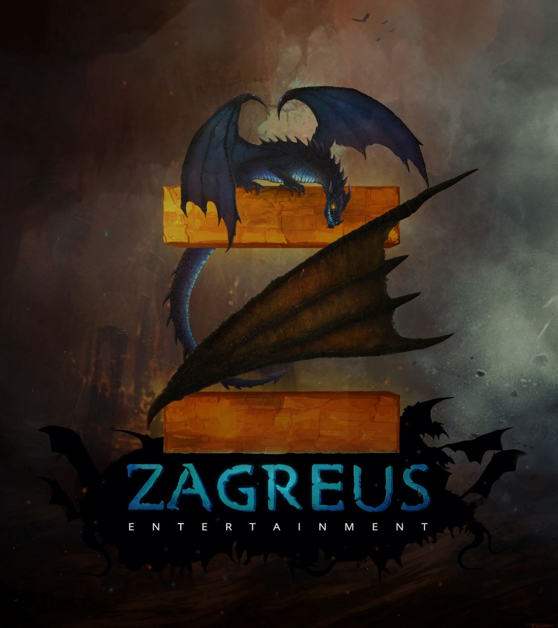
When we decided to design a new logo for our studio, we were extremely confused about it. Why? Because a logo represents the idea and the concept of your work. This is why we felt the dire need of designing a solid logo. Well, this is how we started.
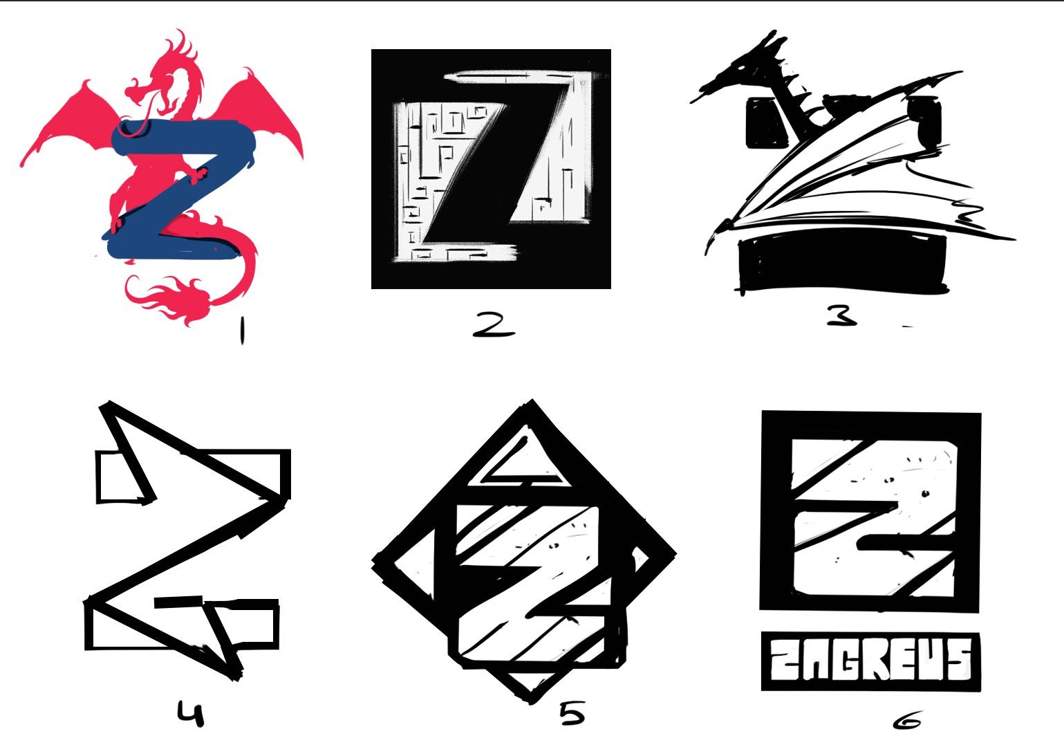
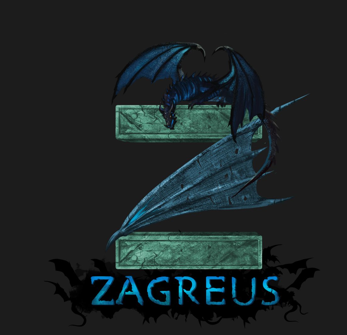
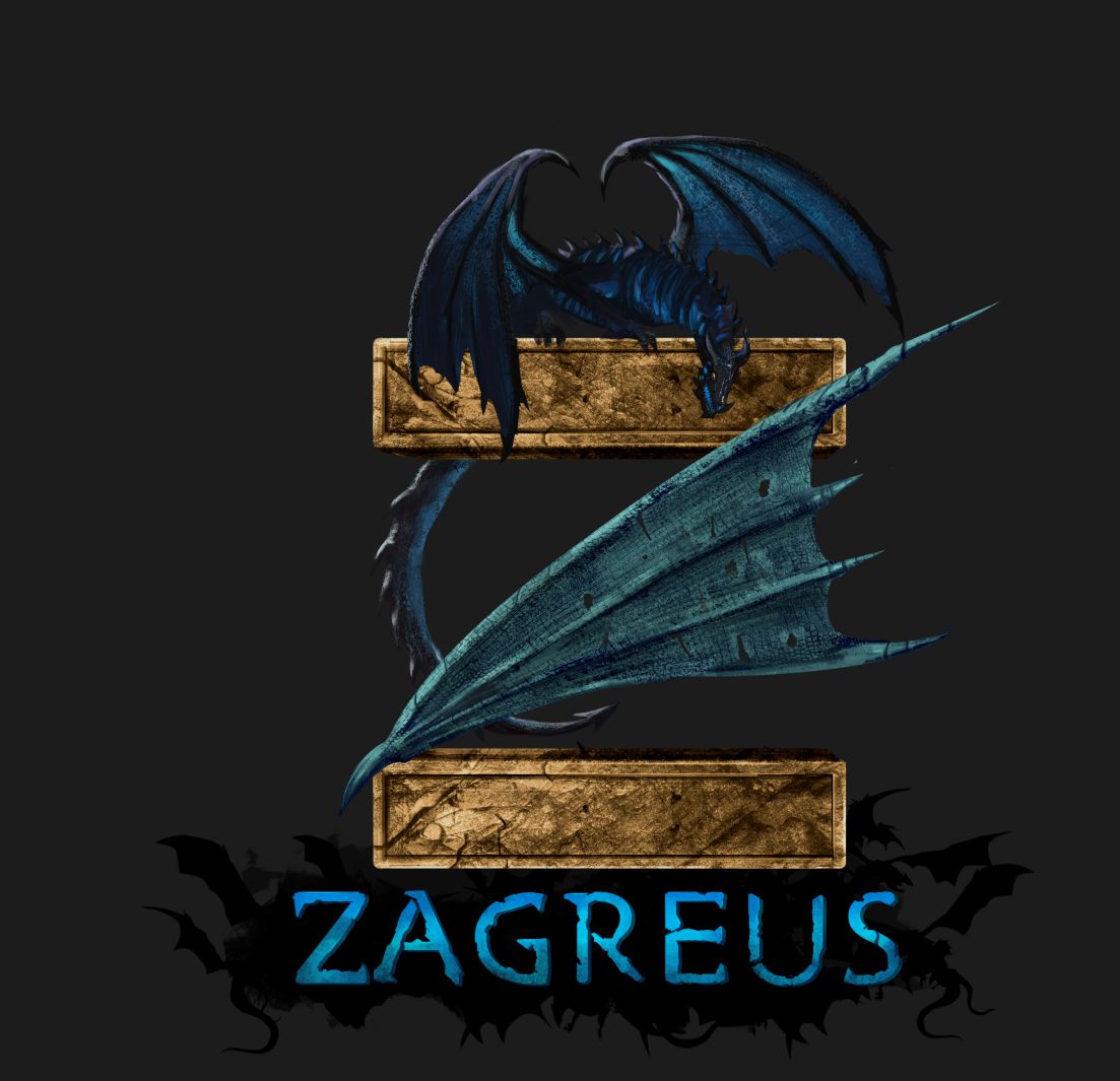
We designed our logo by viewing at the logo designs of the most inspiring and our favorite gaming studios. Since we have always been fascinated by Dragons and there exists some unexplainable relation with the attractive Dragon designs so we thought about keeping it as our chief in the logo. The concept is very clear and straight. We wanted the logo to rotate around our ideas and represent the kind of work we do, luckily it truly explains the nature of our work and the name Zagreus went along with our theme without a glitch. We sketched the logo after trying different kinds of techniques and strategies. Oh well, it was one hell of a task to do.
We tried different shapes, styles, custom fonts, and moved the logo/dragon upside down millions of times until we obtained the final layout. After that, deciding the color of the logo was not an easy job to do since everyone suggested different colors and themes. We did some R&D in designs/colors and finally agreed on the mix and match of splendid colors. Keeping in view everyone’s opinion was our top priority.


